Jeff Knoll and his Ted Moudis Associates team recently worked with IPG MediaBrands, Initiative and UM to transform three floors of a former shopping mall in New York City from plain vanilla offices into funky open space reflective of the creative agencies that now reside there. Other challenges: bringing light into a 95,000 square foot floorplate that had very few windows, moving employees from private offices to free address open plan, and an aggressive budget. Knoll and his team met all of them. How? 1) some seriously creative minds; 2) imaginative use of paint and wallpaper; and 3) using other inexpensive materials in ingenious ways.

Garret Rowland
The first challenge tackled was visually breaking up the large floorplate. To accomplish this, each floor was divided into zones and each zone was given a different color. That color was then tied in between the lights, columns and floors by painting the casings of the existing light fixtures, portions of the columns and the concrete floors. Common conference rooms were distinguished from these zones by color as well – they are finished in a black and white palette. Because paint is an inexpensive finish, this simple use of color also had a large cost benefit.

Garret Rowland
The black and white common areas were each given distinct personalities with different finishes. For example, one common conference room was created by building a drywall “tent frame” and then hanging heavy black and white curtains from the ceiling inside the frame. In another common area, the concrete floor was painted with a black and white pattern and the walls were covered in an oversized floral wallpaper.

Garret Rowland
The Ted Moudis team used bold wallpaper as a tool throughout the space to create architectural effects without hard construction and the associated costs. For instance, Le Salon, a common conference area, is wallpapered with a mural of marble sculptures. Funky furniture and inexpensive yet quirky light fixtures add a further touch of whimsy to the space which had previously been a dark storage room.

Garret Rowland
Another conference room is hung with bookshelf wallpaper to create a fun visual effect. My favorite office (for now) is decorated with a book page wallpaper. All of these finishes are used in a playful way that evokes a sense of humor; none take themselves too seriously.

Garret Rowland
The Ted Moudis team also placed materials typically used as floor coverings in nonstandard places. In one conference room, the blue-paint-spattered white carpeting on the floor was run up one wall. In a hallway elsewhere, Astroturf covers an arch. Astroturf was also used to create “grass” in an indoor beer garden with patio seating and gnome stools. And lastly, a reception desk was covered in flokati rug.

Gnome stools!!!
To address the lack of natural light, high ceilings — most of which are painted white — helped immensely, as did abundant lighting. Although enclosed spaces are few and far between, most feature glass fronts to emphasize the open and bright atmosphere. Per code, architects are required to place “distraction strips” – typically striping of some kind – across glass walls so that people do not inadvertently walk into a glass wall they do not see. In another fun twist, the designers created distraction strips out of interesting and motivational quotes.
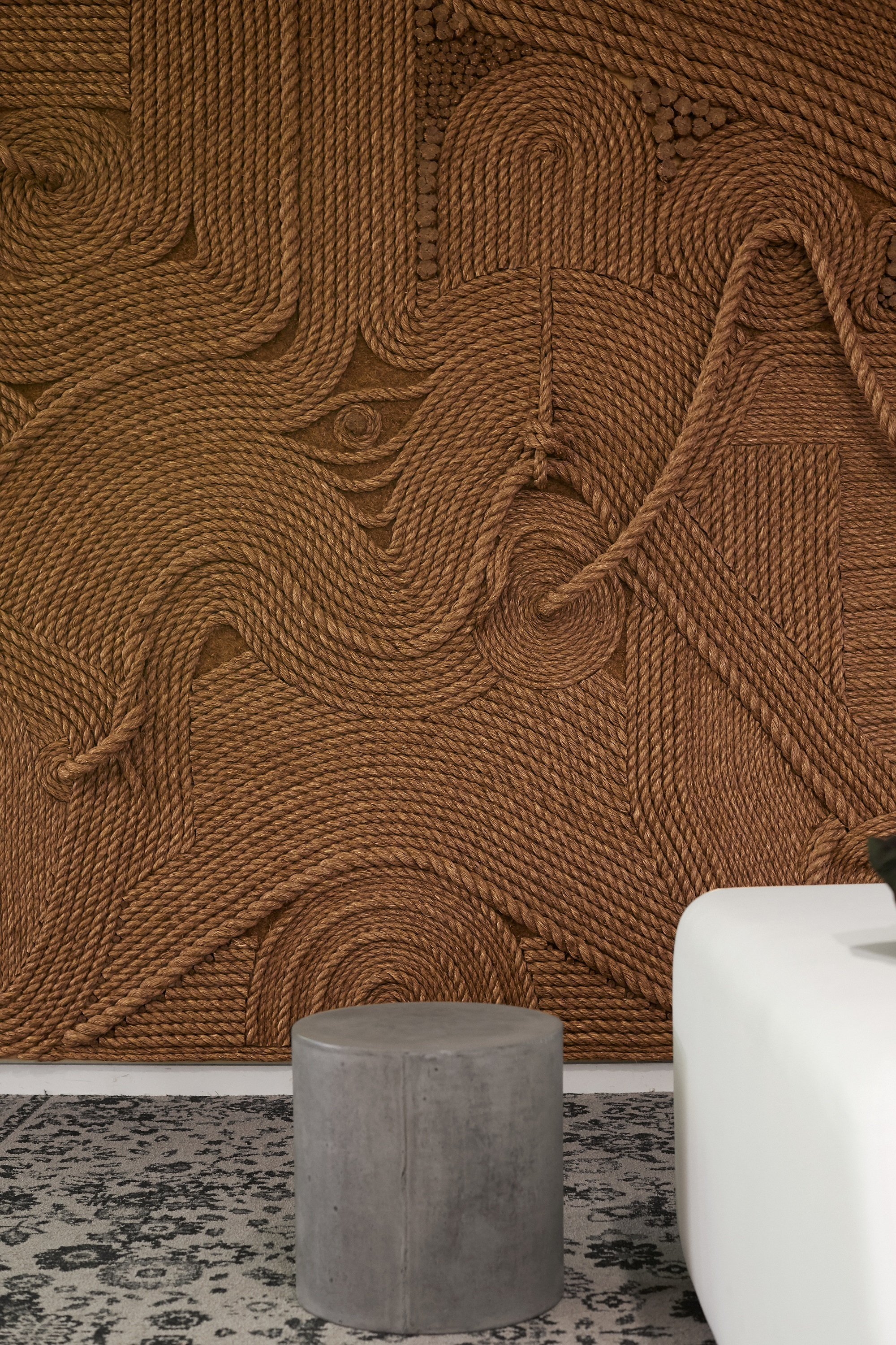
 Not even elevator lobbies were overlooked by the design team. Ted Moudis commissioned a string artist to construct a logo in the elevator lobby on the Initiative floor. On another floor, there was an existing diagonal beam on the lobby ceiling. Rather than downplay this beam, the designers painted the lobby on one side of it yellow and the other black to create an interesting visual effect. The designers wanted to incorporate a funky carpet that is woven to look like a collection of rugs in a lobby area; however, the existing glass doors could not be raised so as to open above the carpeting. The designers came up with a brilliant work-around: they left a rectangle of concrete floor exposed and painted a Welcome mat graphic onto it.
 The clients represented by IPG were also incorporated into IPG’s space in both a nod of appreciation and an invitation to those clients to spend time in the offices. To that end, the space includes a “bubble bar” with red and white bubble images and a Coca-Cola machine. The computer helpdesk is called the “MayDay Bar” in recognition of client Amazon. (The help desk also has a brilliant neon sign over it – “Turn It Off and Back On Again.”)

Garret Rowland

“turn it off and back on again”
My takeaway from touring IPG’s space? No space is “unworkable”. With the right design team, any space can be improved and it does not require unlimited funds. Because of this fact, I encourage my clients to bring their architect along when we tour options. It can really help them understand the possibilities, especially if they lack that kind of creative vision.
Read more about creating office space that encourages collaboration here.


