In today’s work spaces, there are abundant examples of reflecting and promoting brand in office design. Why? To remind your employees and your clients of your company’s purpose. Sometimes, incorporating brand in office space comes naturally. For instance, if your company sells a product, you can integrate that product and reminders of how it solves problems for its consumers throughout your space. Be careful: this can be easily overdone. On the other hand, if your company sells a service, your brand image might be more abstract and therefore harder to define and reflect.
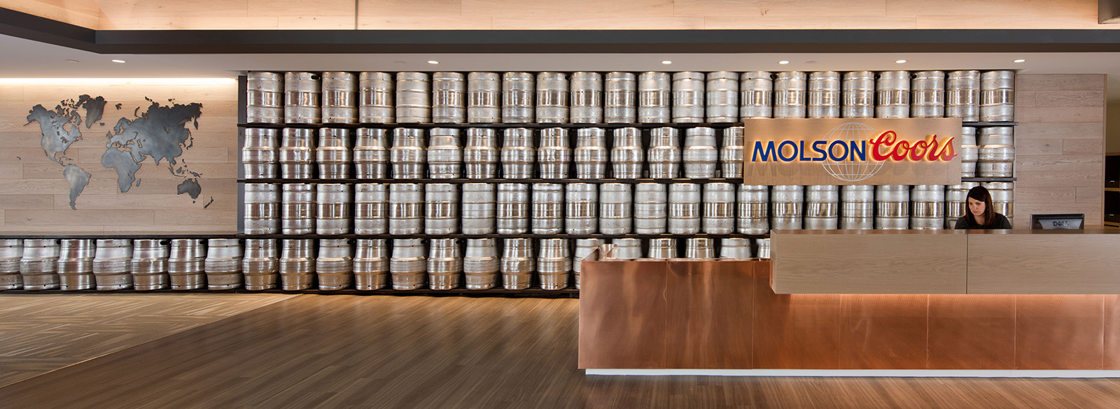
 In my travels recently, I have seen brand boldly incorporated in design. In the same spaces, I have also seen some interesting but subtle reflections of brand. An example? When you walk into Molson Coors’ offices in a high-rise Denver building, the first thing you see is a wall of kegs behind the reception desk. Turn around and you will notice that the creative team at architecture firm RNL Design built an adjacent pub with window views that mirror the mountains seen on a Coors can. You know that you are in the space of a company whose product and passion is beer.
 There are other, gentler reminders of Molson Coors’ business throughout the rest of its space, including barley emblems in the iron stair rails and keg pulls installed as handles on the office doors. The design team also sourced some antique Coors brewing implements and equipment to display on walls throughout the space as a nod to the brand’s rich history. On a louder note, bright beer murals are painted on walls throughout the office areas.
 Disaster recovery technology firm Agility’s service is a little more abstract than beer. Agility’s brand is built on its ability to help clients react to the effects of storms and other disasters. Consequently, in Agility’s new offices in Denver, Interior Architects incorporated materials and finishes to evoke a storm motif which reminds both employees and clients of the company’s purpose.
 As one enters the elevator lobby, the colors are darker and the ceiling features a wood sculpture that branches out like lightning/clouds. In the work space areas, architectural “clouds” fan out beneath the open ceiling. Similarly, the floors feature polished concrete with carpet clouds fanning out to reflect the ceiling clouds. The space feels moody, stormy, or bright depending on where you are sitting.
 How can you incorporate brand in your company’s office design? In my experience, success at doing so depends on two things: (1) your understanding of and ability to communicate your brand and (2) choosing an architect/interior designer who you believe can take that information and translate it visually within your space on your budget. We try to help our clients with #2 to ensure that they end up with space that accommodates their office requirements AND promotes their brand.


