Google designs its work spaces to encourage collaboration because, as data-driven research company Sociometric Solutions has found, “the biggest driver of performance in complex industries like software is serendipitous interaction”.
With this in mind, I was excited when a grad school classmate of mine agreed to give me a tour of Google’s New York City campus last month. Google is said to be one of the best examples of a workplace designed to encourage “collisions” and a walk through the space is confirmation of this fact.
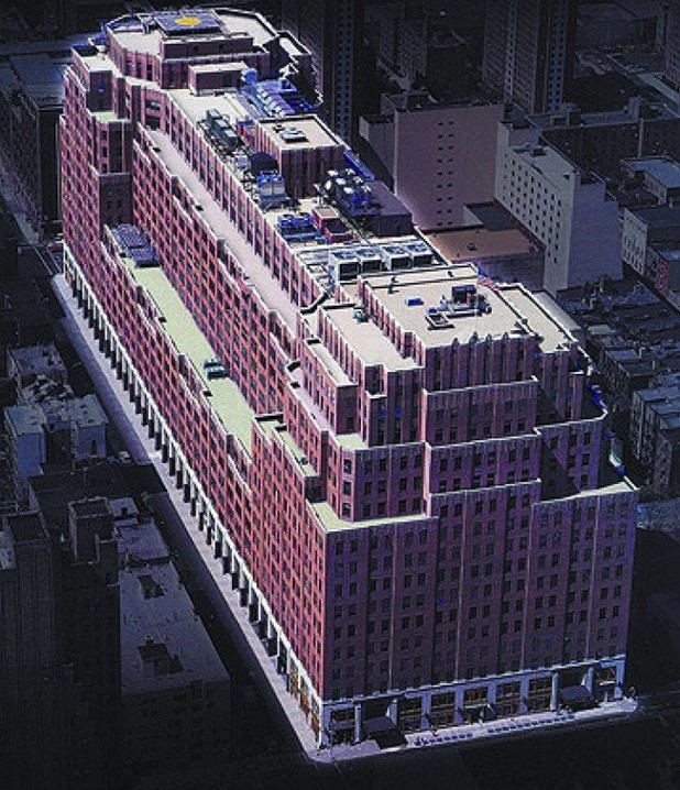
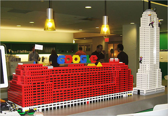
The epicenter of Google’s NYC campus is the 3M square foot, 16 story 111 Eighth Avenue Building that Google bought for $1.9B in 2010. The building has been compared to the Empire State Building lying on its side – only it’s 1M square feet bigger! Google loved the building’s large floorplates which amass more people in one place and increase the occurrence of interactions.

111 Eighth Avenue, New York, NY
In addition, the building sits almost directly on top of a large fiber highway in Manhattan and consequently was especially attractive to Google. Google has recently acquired additional neighboring Chelsea real estate (including a pier) to house their ever-increasing headcount. Presently, there are ~6,000 Googlers in New York.
Each floor at 111 is designed to provide environments for teaming and socializing as well as quiet, focused work. One side of each five-acre floorplate features living room seating areas and other comfortable nooks. The center core is comprised of huddle rooms, massage rooms, pantries, etc. Along the other side of the long floorplate are workspaces with extensive benched desking. In these areas, the volume is kept low so Googlers can focus on their projects.

The mood on each floor is dictated by themes which vary from “The Four Seasons” to “New York City”. As you travel down the hallway on the Four Seasons floor, the seasons change from Winter through Fall. Each seasonal section of the floor is finished with different materials to evoke the seasonal moods. The winter section has cool colors, white frosted glass and conference rooms with themes like “Festivus” and “Winter Wonderland”. The fall section is all warm woods and autumnal colors. Whatever your aesthetic preferences, there is a place for you.

All floors include pantries and several include extensive cafeterias. Although junk food can be found on campus, healthy eating is encouraged by displaying healthy options in transparent containers while unhealthy options are hidden in opaque containers with nutrition information prominently displayed. Even the refrigerator doors are frosted to hide the sodas from plain view while the mineral and sparkling waters are easily seen.
During my New York City visit, I also attended a conference where Adam Lutz, Google’s Real Estate Project Executive, said that because of their health focus and because the building is seriously underserved by elevators, Google emphasizes “active design”. Googlers are encouraged to use stairs to travel between floors and the long floorplates ensure that Googlers take plenty of steps each day. In addition, Google offers massage services, fitness centers and various classes on their NYC campus.

As I walked the corridors and cafeterias of Google at lunch time, I was amazed by the buzz and the number of conversations happening. I haven’t seen their metrics, but if my experience is an indicator, serendipitous interaction is everywhere and Google’s future looks bright.


[…] you want to read more, go here to learn how Google built to encourage serendipity in New York […]
[…] resource-constrained but full of adventure and fun. A start-up’s office may not feature Google-like slides or LinkedIn’s silent disco, but it will probably hold a special place in the initial staff’s […]